
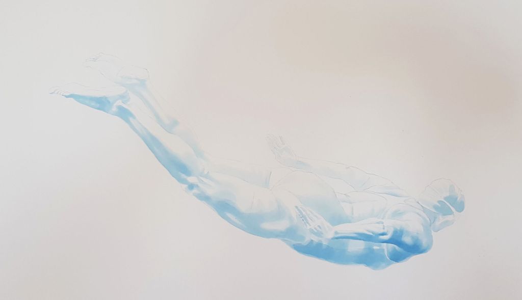
“Cathedral Light” – painting in watercolour and gold leaf
It’s been quite a while since I painted – in real paint. This is my latest swimmer painting, finished this week, in watercolour with gold leaf ‘bubbles’. It will be available as a print in my shop in a few days time.
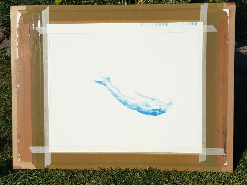
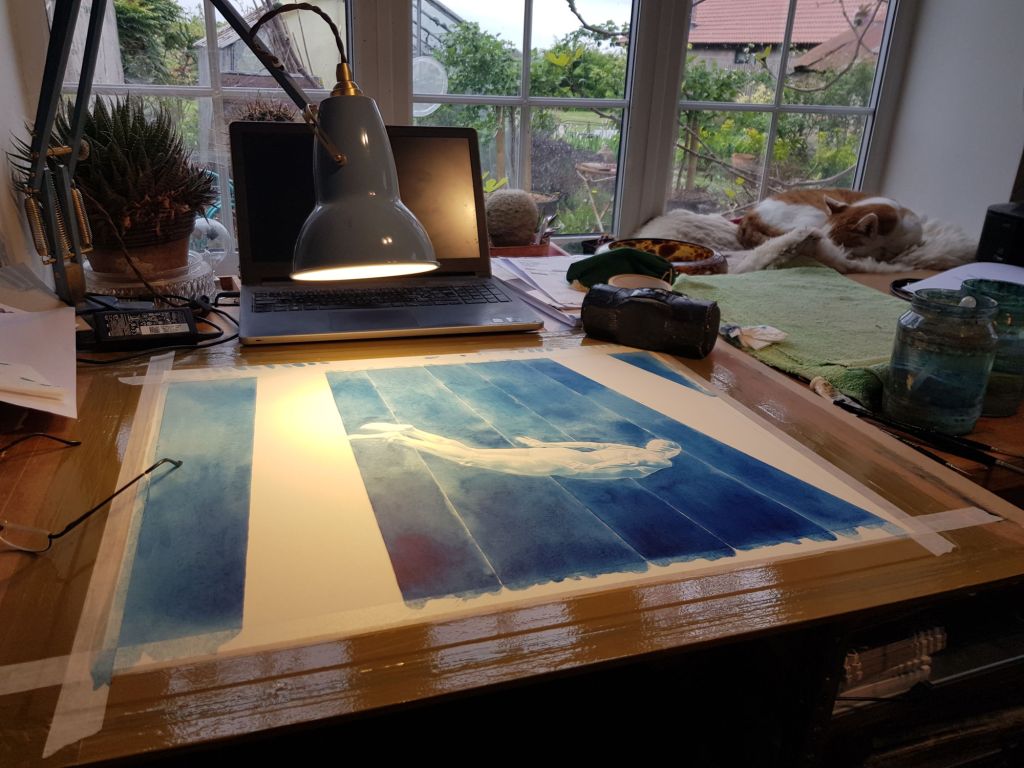
The following are a few work-in-progress pictures and explanation of some of the stages, which I posted on my facebook page as the painting progressed.


Note: there is no colour change between this picture and the previous one, but the lighting was different 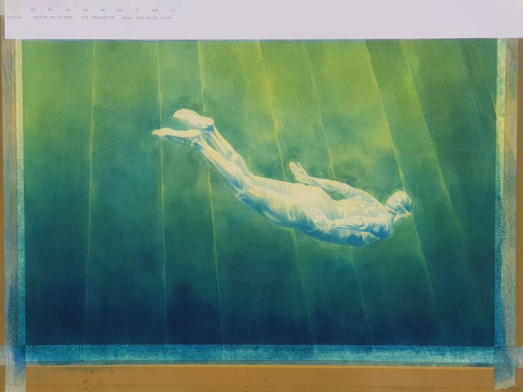


All the colours I used, apart from the blue which is Prussian Blue. 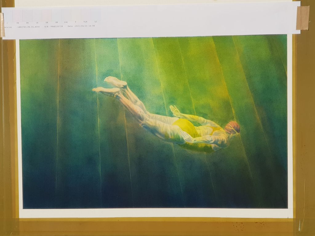
About the stripes:
There is a fundamental difficulty with backgrounds and watercolour: how to get a nice overall background colour which is very strong, behind a subject in the foreground. You can’t literally have it behind the subject: you can’t paint the background and then put the subject on top, because watercolour is transparent. White is created not by white paint but by clear white paper. Yes, you can paint details with little bits of white gouache paint, but just try it and you will find it’s not nearly as bright as the white of the paper. White paint isn’t really a watercolour thing, and light colours are generally created not by adding white but by painting thinly so more paper shows through.
The further catch is that because watercolour paint is runny and thin and dries quickly, you can’t slowly fill up the space, carefully going round a subject and then doing the large areas. To get a continuous colour you more or less need to keep the whole thing continuously wet. If areas dry you get tidemarks at the edges. Deep water has no tidemarks…
Over the years I’ve tried several ways to solve this problem: masking fluid or painting out the subject with thick gouache and lifting it off are two methods in particular. Each has advantages and disadvantages, and this method is no different in that respect: there’s always compromise. But those other ways tend to damage or blur some of the original detailed work on the figure. This doesn’t, but instead I am painting the background in sections, each of which is simple enough that I can do it fairly smoothly. I’m introducing hard lines into my background as long as I can have them where I can make use of them.
Deep water has no tidemarks, but it can have shafts of sunlight. So instead of just hard lines, I’m leaving the tiniest gap between the sections. Ultimately I don’t intend to leave them as bright white lines but I’ve not tried this particular idea quite in this way before: nothing ventured, nothing gained…
The finished painting: “Cathedral Light”
The lighting suggested stained-glass windows to a friend of mine, and so I called it this. It is, to be honest a little more multi-coloured than I had intended, but it’s best to work with watercolour than against it, and this is the way it went. The title now makes me want to paint a really stained-glass looking one, somehow combined with another swimmer.
The lines are also more obvious than I had anticipated, I had imagined having to enhance them to bring them out again, rather the opposite in practice. The final part of the painting (before the gilding) is a process of enhancing the highlights by lifting off some of the paint – usually by scrubbing and blotting with tiny cut-down bristle brushes. The amount of paint lifted is tiny, but the difference to the finished picture is immense. It’s a very useful technique if you plan for it.
And there you have it: my first actual painting in a long time. There will be prints available in my shop soon, but I’m currently hanging onto the original: I have a long-postponed exhibition on the horizon and I shall need paintings for it.

